Last night on the NewsHour, Dante Chinni of Patchwork Nation explained the thinking behind mapping different types of communities and how looking at location and context together create a deeper picture of what the American economy looks like.
“But it’s more than that, because, when you break the counties out into these types, as we do, we’re able to get a feel for — in each one of these 12 communities, we have identified who’s getting the most, not even in per capita terms, but in just real raw numbers terms,” Chinni said.
Check out the full interview:
A new map from National Journal takes a look at where the uninsured in America are living, broken down by Congressional district. South Florida, Central California, and South Texas appear particularly hard hit.
How about posing a question to lawmakers in those districts (or your own) about health care reform?
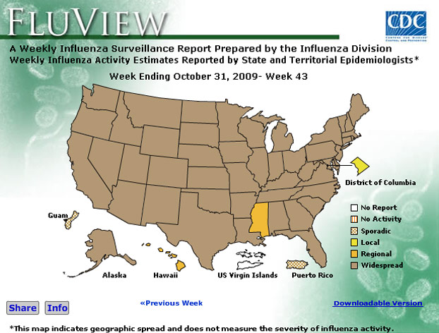
While only tangentially related to the economy, it’s interesting to take a look at this new mapping project on the flu from the Center for Disease Control as an example of how government agencies are starting to think about maps that can be shared online to spread information. For more flu updates, visit Fluportal.org.